
Use case
Give your next announcement something to show.
Bring a blog post, newsletter or launch message. Pull out the strongest idea and turn it into a graphic that fits the reader, the channel and the next step.
A newsletter idea, made visual
Made with Rubiic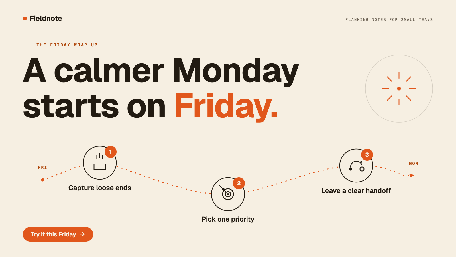
The graphic distills a supplied newsletter excerpt into three actions. It is an editorial illustration for a fictional brand, not customer evidence.
Find the idea inside the content
A blog post, newsletter or launch announcement already has something to say. The graphic needs to make its central idea visible. Give Rubiic the source text or an accessible page, name the audience and explain what the reader should do next. It can help you choose an angle and develop a visual around it.
The example above starts with a fictional newsletter about a Friday wrap-up. Its three actions become a connected illustration, with a headline that introduces the article. The full explanation stays in the newsletter.
Bring the source, the reader and the destination
- Source: the actual article, excerpt or announcement, including any claims and qualifications that matter.
- Reader: a prospect, customer, employee or community member.
- Purpose: understand an idea, read the article, explore a feature or attend an event.
- Placement: newsletter header, blog illustration, launch card, presentation graphic or social post.
Match the visual to the message
A process often becomes a sequence. A comparison benefits from a shared scale. A launch can focus on one visible change. An abstract editorial idea might need a metaphor. Choose the structure before adding detail, and keep statistics, quotations and product claims tied to the source you supplied.
Ask for a headline, a supporting line only if needed, and enough space for the image to breathe. Shrinking every paragraph onto a canvas rarely makes a useful graphic. Review the draft alongside the source so an important qualification does not disappear.
Adapt the idea for each channel
A wide newsletter header and a vertical social post need different layouts. Keep the idea and visual direction, then recompose for the new format. For email, make the first frame useful when motion does not play and keep essential information in live email text too. Add descriptive alternative text when you publish.
Download the available image or motion exports and place them in your publishing tool. For a longer demonstration, explore product and feature explainers. For a series of feed posts, see social content.
Try a brief like this
A starting point to adapt to your product and audience. This is a suggested new brief, not the original conversation behind the example.
Turn this newsletter excerpt into a 1600 × 900 header graphic for Fieldnote, a fictional planning brand. Audience: small teams. Goal: encourage readers to try a Friday wrap-up. Source: 'Before closing your laptop on Friday, capture loose ends, choose one priority for Monday, and leave a clear handoff for teammates. A short wrap-up can make it easier to restart.' Use the headline 'A calmer Monday starts on Friday.' Visualize the three actions with a simple connected illustration. Cream background, dark ink, orange accent. Keep the body copy in the newsletter. Export a PNG.
What will you make next?
Rubiic is invite-only while it scales. Join the waitlist and we will tell you when a seat opens.