
Blog · · The Rubiic team
When animation makes marketing content more engaging
Learn when videos and animated infographics help explain your message, with practical ideas for newsletters, blog posts and social content.
The article is written. The newsletter is nearly ready. The social post needs a visual.
You could pull out a quotation, find a stock image or put the headline on a colored background. Sometimes that is exactly what the story needs. But sometimes the interesting part is something your audience needs to see happening: ingredients coming together, a feature changing a workflow, or a pattern emerging from data.
That is where a short video or animated infographic can earn its place.
The strongest reason to use motion is the explanation it makes possible. A useful animation gives your audience a clear path through an idea and a reason to take the next step.
What the evidence actually says
Research gives marketers reasons to experiment with animation. It also gives us reasons to be precise about what we promise.
In education, a 2016 meta-analysis covering 61 studies and 7,036 participants found a small average learning benefit for animation over static graphics. That is evidence about learning, not a prediction of clicks or sales. It supports a useful design hypothesis: motion may help when understanding the subject involves understanding change. Read the paper by Berney and Bétrancourt.
There are encouraging social benchmarks. Metricool's 2026 Instagram study reports more than four times as many interactions for Reels as for single-image posts. This is an observational comparison of formats, not a controlled test of animation or a promised uplift for your account. See the Instagram findings.
There is also no universal winning format. Metricool's 2026 LinkedIn study found carousels and multi-image posts ahead of video across many measures in its sample. That makes the creative question more useful than a format rule: what does this particular audience need to see? See the LinkedIn findings.
Website context matters too. Wistia's 2026 research reports different video viewing patterns across page types. It does not demonstrate that adding a video causes a fixed increase in blog engagement. An embedded explanation should therefore have a clear role on the page and a measurable purpose. Explore Wistia's report.
Taken together, the evidence makes a case for thoughtful use and testing. It does not make a case for adding movement to everything.
Give the movement a job
Before choosing a format, finish this sentence:
“After seeing this, our reader should understand…”
The answer should be one useful idea. For a product launch, it might be how a new feature removes a step. For a consumer product, it might be what goes into it. For a research story, it might be why a relationship matters.
Then decide what the audience needs to see:
| Your communication task | A useful visual approach |
|---|---|
| Explain a process | Show its steps in a readable sequence |
| Demonstrate a feature | Show the starting state, action and result |
| Introduce ingredients | Reveal each ingredient with a short factual label |
| Compare alternatives | Keep the scale consistent and reveal the difference |
| Explain an abstract relationship | Use a labeled diagram or a clearly identified analogy |
If the viewer has to chase several moving labels while reading a paragraph, the animation is asking too much. Let the important change happen, then give people time to understand the result.
Three stories, three visual treatments
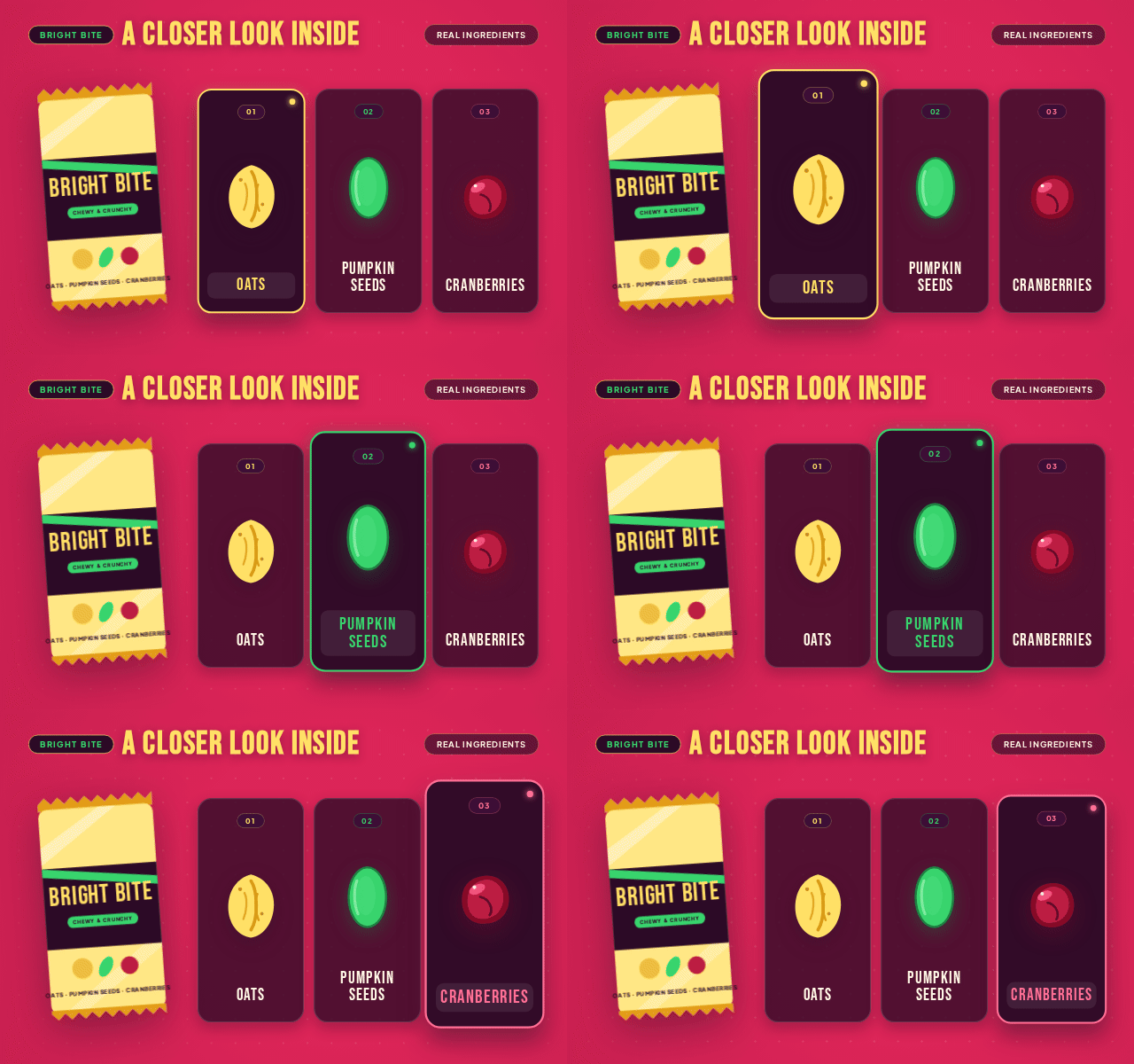
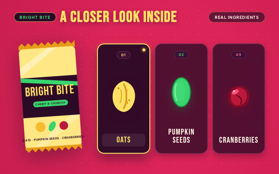
Consider a fictional oat-and-seed snack bar. Its first visual might be bright and tactile: warm yellow, berry pink, bold lettering and ingredient illustrations that settle into place around the product. The sequence gives each ingredient a moment of attention, followed by a close view of the texture.
The lesson is specific: use movement to reveal what the product contains. Claims about nutrition, certification or sustainability still need product evidence. An attractive animation cannot supply that evidence for you.
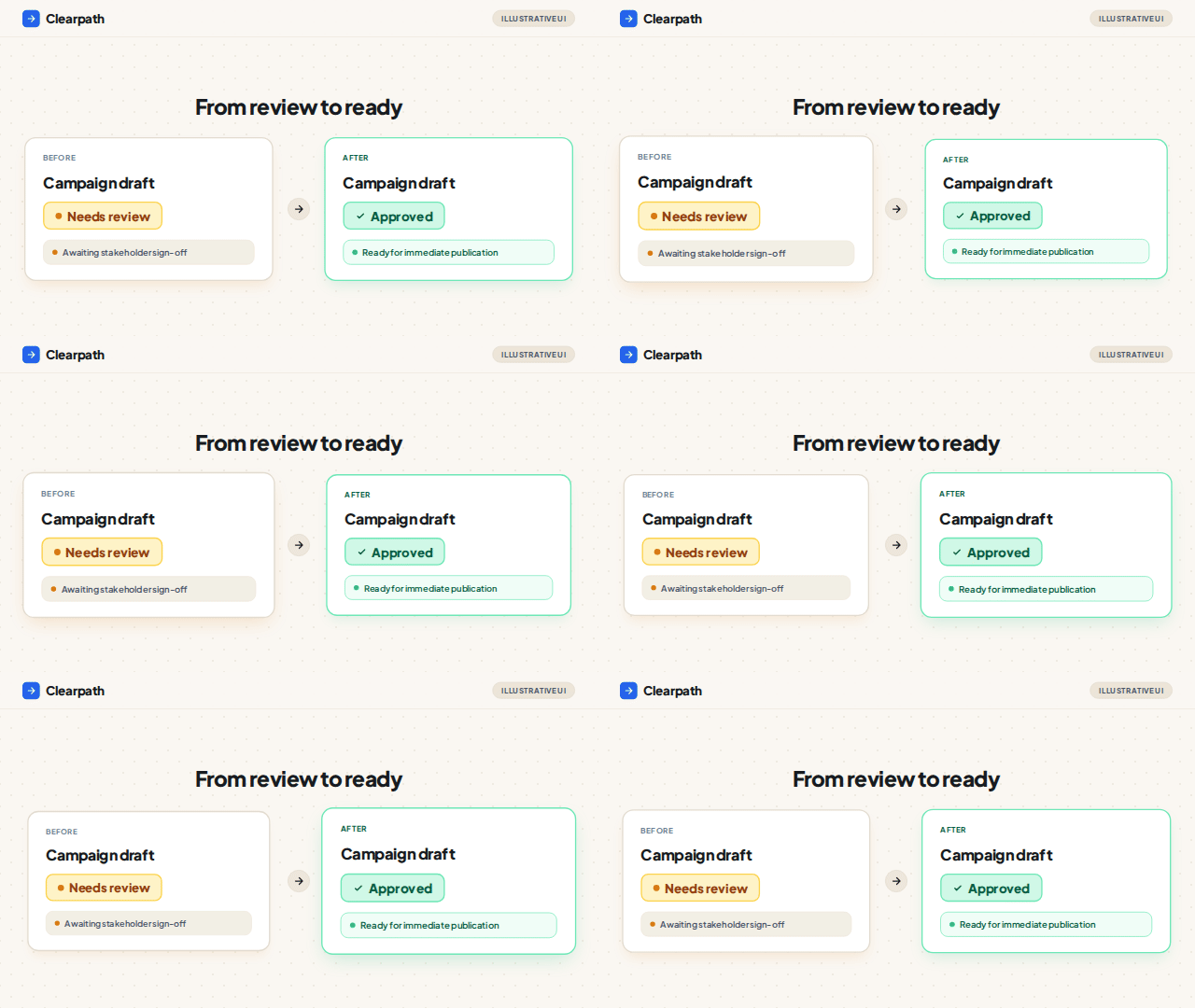
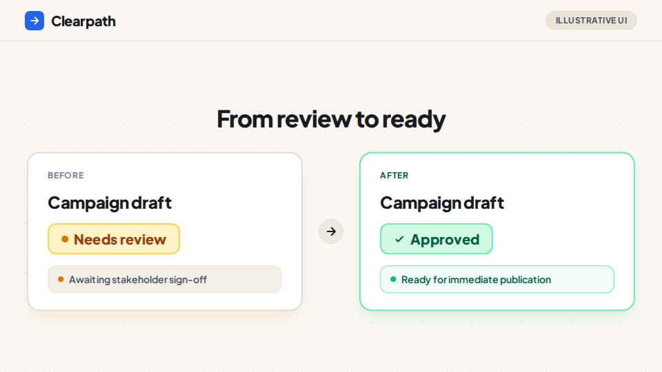
A software update needs a different treatment. Picture a team collecting approvals in a shared workspace. A short demonstration shows one item moving from “Needs review” to “Approved.” One interaction and one visible result explain the feature more directly than a succession of broad promises.
A research story calls for a different pace again. A diagram can introduce the question, establish a visual vocabulary and reveal the relationship being investigated. The viewer should be able to follow the explanation without mistaking an illustration for experimental data.
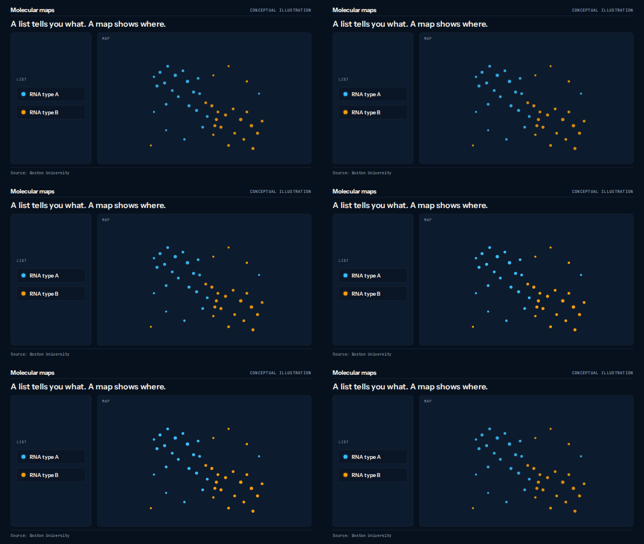
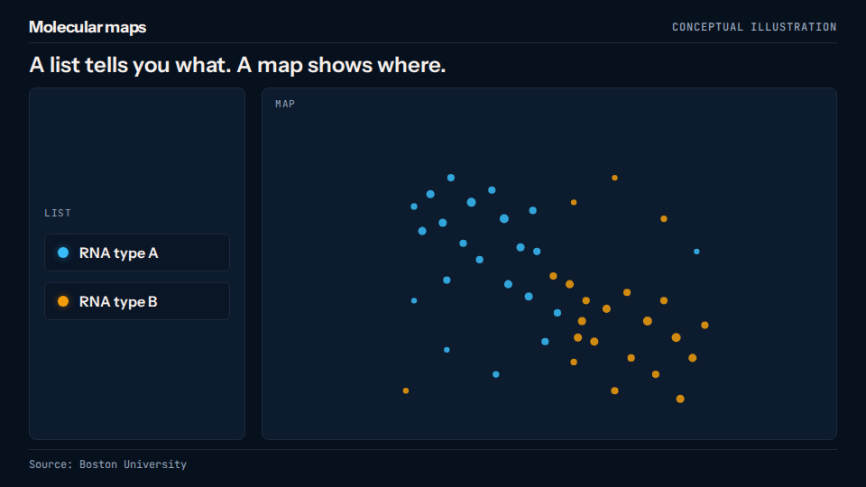
These examples share a discipline: the visual structure follows the communication task.
Adapt the explanation to where it will appear
On social, open with something the intended audience recognizes. A familiar problem or intriguing visual relationship is a useful starting point. Keep the message understandable without sound, and give the final frame a specific next step.
In a blog post, place the animation where it answers a question the reader has just encountered. Keep the surrounding explanation available as text. Someone who chooses to read instead of play should still get the substance of the article.
In a newsletter, think of motion as a compact invitation to the fuller story. A short linked preview can demonstrate the idea before asking the reader to continue. Mailchimp recommends linked video previews because embedded video lacks broad email support. See its email video guidance.
The same underlying concept can serve all three channels, but the layout, pacing and amount of detail should fit the placement.
How Rubiic approaches the brief
Start with the material you already have: an accessible article, approved product copy or a short explanation. Add the audience, destination and the action you want someone to take.
Rubiic uses that context to develop a visual approach. A process can become a sequence; a product feature can become a demonstration; an abstract idea can become a diagram. You can review the direction and ask for changes in conversation.
This is the useful role of orchestration: coordinating the explanation, design and production around the brief. The publishing goal shapes the creative decisions.
Try a request like this:
Turn this product announcement into a short visual explanation for our customer newsletter and LinkedIn page. The audience already knows our product. Focus on the one new action they can take. Use our approved colors, keep the on-screen copy short, and suggest a useful still alongside the animation.
Test the result you care about
A video view tells you that someone watched. It does not tell you whether they understood the idea or acted on it.
For a newsletter, compare qualified clicks and what people do after clicking. For a blog, compare the next action you want readers to take. For social, look at useful responses, saves or visits alongside viewing behavior. If comprehension is the goal, ask a simple question that tests the idea you wanted to communicate.
The practical starting point is one existing story, one clear takeaway and one visual treatment to test.
See the finished examples and start your own in Rubiic’s animated infographic workflow.
See what it makes for you
Rubiic is invite-only while it scales. Join the waitlist and we will tell you when a seat opens.