
Blog · · The Rubiic team
Animated newsletter graphics: one useful idea, one clear click
Plan a useful newsletter GIF: choose one idea, make the first frame count, link to the full story and measure the clicks that matter.
Your newsletter already has a story worth reading. The visual should help readers see why it matters.
A short animation can show a change that takes several sentences to describe. It might reveal an ingredient, demonstrate a product action or connect the pieces of an idea. That gives a newsletter graphic a practical purpose: help the reader understand the invitation before deciding whether to click.
The best place to start is the main story in your next send.
Choose the moment that deserves motion
Read the story and find the moment where seeing would help. For a feature announcement, that might be a setting changing and its result appearing. For a product story, it might be the ingredients separating from the finished product. For an editorial piece, it might be a relationship becoming visible.
Keep the preview focused on that moment. The email can introduce the story in a sentence, the animation can show the idea, and a live-text button can take readers to the full article or demonstration.
A useful brief might say:
Create a short newsletter animation for this announcement. Show one clear change and leave time to read the result. The first frame should work as a complete image. Keep the headline and call to action available separately as email text.
Use the evidence as a reason to test
One often-cited example comes from Dell. A 2014 campaign used a GIF to demonstrate a convertible laptop's movement. Its click rate was 42% higher than Dell's quarterly campaign benchmarks. However, the team compared previous campaigns rather than running a randomized A/B test, so the result cannot be attributed to animation alone. Read the original MarketingSherpa case study.
The useful creative lesson is that motion showed something important about the product. Your own test will tell you whether the same principle helps your readers.
Build for the inbox
Use a linked GIF or still preview and put the full video on a page where people can watch it. Most email clients do not support embedded video. Mailchimp explains the linked-preview approach.
Make the opening frame meaningful on its own. Some email environments show a static frame instead of the animation. Preserve the main message outside the graphic, give the image useful alternative text, and test the actual email on the clients your audience uses. See Mailchimp's image design reference.
Keep the file compact enough for the send. Shortening the sequence, reducing its dimensions or simplifying its colors may help. Judge the final file in the email, including its loading behavior and small-screen readability.
A colorful product example
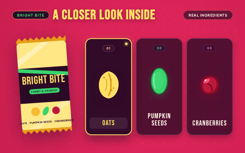
Our fictional Bright Bite example highlights three snack-bar ingredients: oats, pumpkin seeds and cranberries.
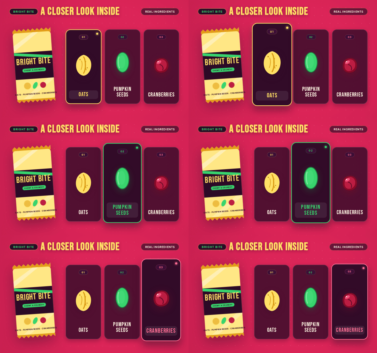
The revised video opens with the package and “Take a closer look inside.” Each ingredient moves into view and pauses beside its label. We made a separate newsletter composition that shows the package and all three ingredients from the first frame, then gently emphasizes each ingredient in turn. That complete opening frame also works as a still.
Below it, the email says:
Oats, pumpkin seeds and cranberries, brought together for a chewy, crunchy snack break. Take a closer look at the recipe.
The button reads Explore the ingredients.
The example keeps the product story specific. Add nutrition or environmental claims only when the real product's approved documentation supports them.
Measure the next action
For a useful test, randomly split comparable recipients between the same email with a still and with the animation. Keep the subject line, offer, CTA and send time consistent. Decide the test size and the improvement that would matter before sending.
Use unique human clickers per delivered email and the relevant action on the destination page. Open rates are unreliable for some recipients because of Apple Mail Privacy Protection; automated link checking can also inflate clicks. Apply the available bot filtering and inspect downstream behavior. Mailchimp on privacy-related opens, and on bot activity.
A preview succeeds when it brings the right readers into the story. More movement, by itself, is not the goal.
See the finished examples and start your own in Rubiic’s animated infographic workflow.
See what it makes for you
Rubiic is invite-only while it scales. Join the waitlist and we will tell you when a seat opens.